by
by E-commerce and food supplements were two areas that generated a lot of mistrust until a few years ago, marked by stigmas of blows and possible losses. Today, however, both have consolidated. Sales of supplements have been growing for a long time and e-commerce is more popular than ever, much because of the social isolation forced by the Covid-19 pandemic.
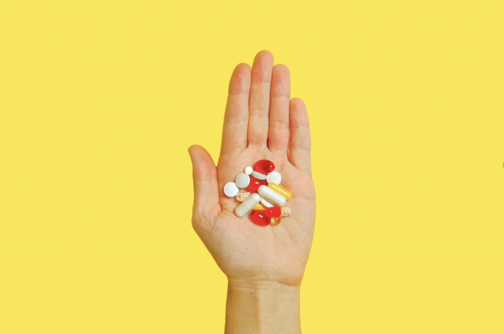
For these reasons, the e-commerces of supplements are on the rise, creating a new challenge for designers. How to make something so essentially functional visually attractive? This, of course, depends a lot on the store’s intentions, but some tips can be followed to run away from stereotypes and conquer more public.
First of all, it is necessary to understand the target public of the supplement trade. Here, it is very important to try to escape a little from the images of people in the academy and extremely strong, because a good part of the increase in supplement sales recently is related to another consumption profile: those who just want to complement the food, including even the elderly who suffer from some food deficiency.
Another very common mistake made in designing supplement websites is related to images and gender. Accessing some sites, it is common to see mostly male photos on the pages, which also goes against the trends of the sector Reports of consumption of the site Healthy & Beauty, specialized in the field, show an increase in the female public in the trade of supplements, evidenced by the growing number of searches for supplements made by women.
A very relevant factor to consider today is the profile of the online buyer. Because of Covid-19, many people started to buy through the internet, mostly without so much familiarity with e-commerce. Therefore, more than ever, the user experience is important. Prioritize the ease of access to information, in a clear way. One tip is to follow the trend of e-commerce with a clean and minimalist look, making everything more accessible.

This is another great challenge for designers who have ventured into this area. In the supplement market, the information is essential and very numerous: for whom is this supplement indicated? What are its benefits? Which nutrients compose the product? What is the dosage? How much does it cost? Among so many information, the ideal is to leave only the basic visible, collaborating for the user experience. Even so, it is not possible to give up the other information, being necessary to adjust it in the specific page of the product.
One way to make navigation easier for users and make the pages more personalized according to the public is to divide them by categories of interest in relation to supplements, such as increase in muscle mass, weight loss, resistance, diet complementation, among others. From the moment everything is segmented, it will be much easier to work with each persona and create the most efficient design.